A-League kits 2023/24

Thought it could be handy to have a place to compile all the A-League kits for the upcoming season, starting whenever it might be!

First A-League season to feature 12 teams.

Adelaide United - I really rate the home shirt but not so sure about the away. As I saw Les say on twitter, it looks like a cheeseburger wrapper.

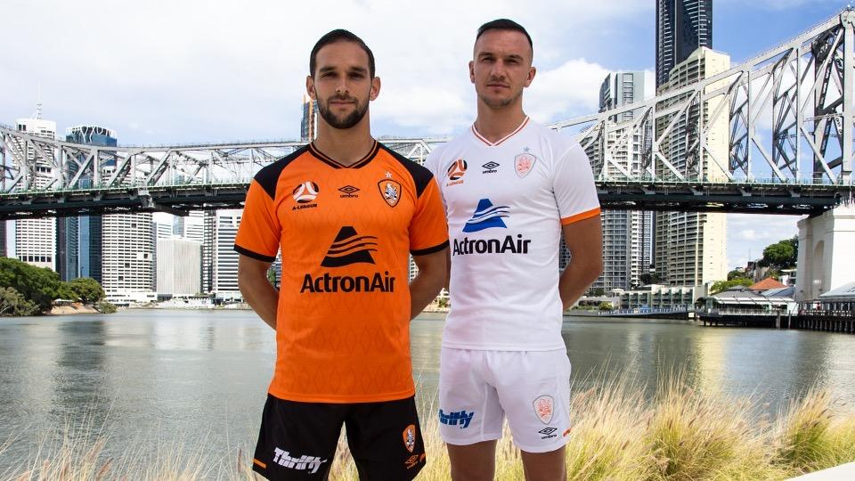
Brisbane Roar - Supposedly a throwback to the jersey they wore when they won the league the first time. I am a fan of the white away shirt, but not sure that they need to have the white shorts too.

Macarthur FC - as posted elsewhere. I think the bull image on the front makes for a memorable and collectable first ever home jersey.

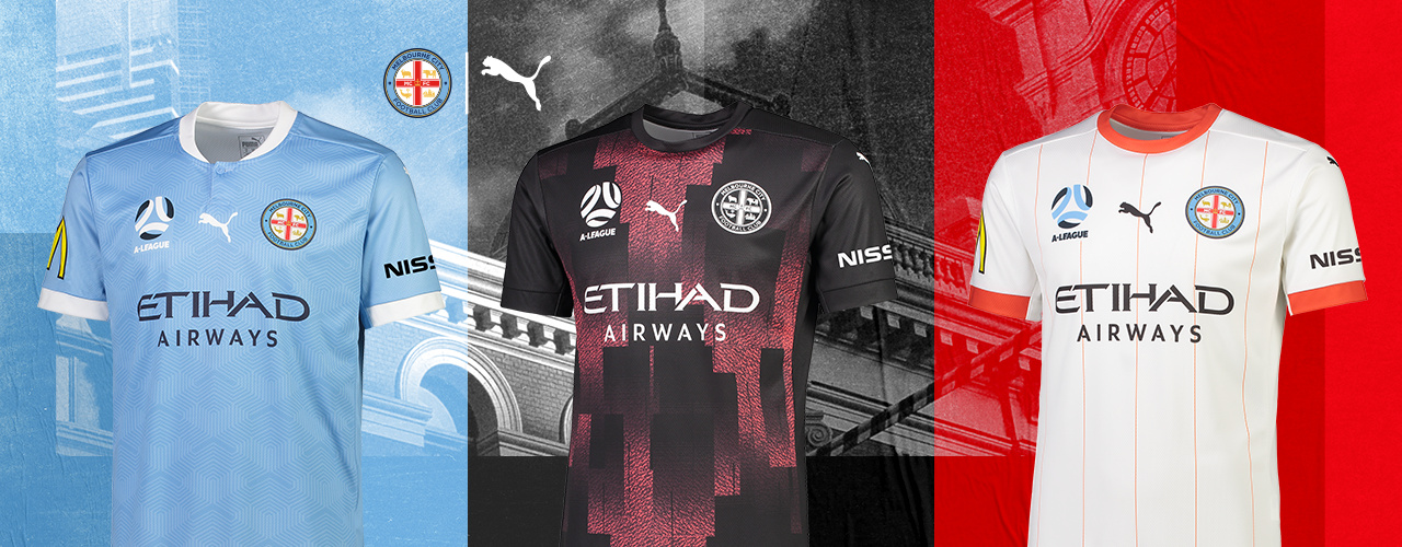
Melbourne City - Home kit is as usual a boring Manchester City knockoff, the away kit has to be up there for worst jerseys ever in the league. The white third shirt would be much better as an away.

Melbourne Victory - they look like pretty decent kits, again impressed to see the white away.

image

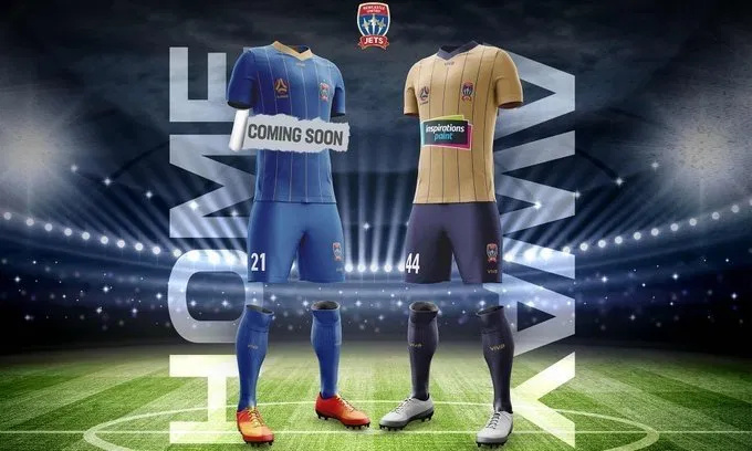
Newcastle Jets - I like these ones a lot, glad to see the Jets going with blue and gold, not trying to be a knockoff Knights. If only the gold could be the home kit though.

image

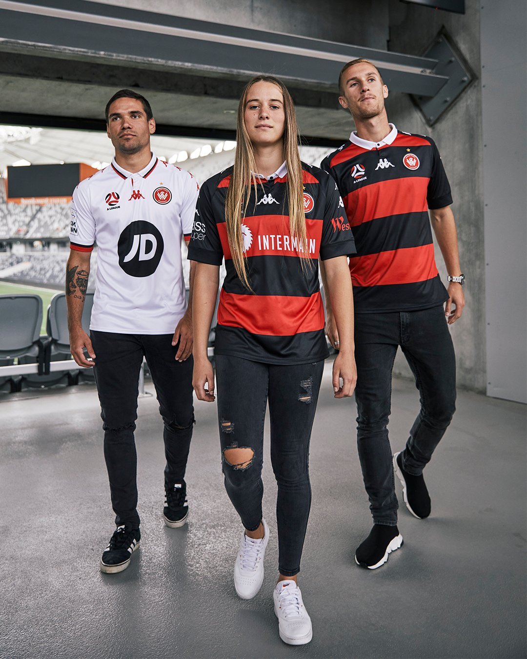
We’re still waiting on Central Coast, Perth, Wellington, Western Suburbs and Western United as well as Sydney. It’ll be WSW first season with Kappa.

1 Like

Could they be any more chav? Will sell by the bucketload to their core audience.

3 Likes

Not a bad kit but that white collar ruins it

1 Like

Arlo?

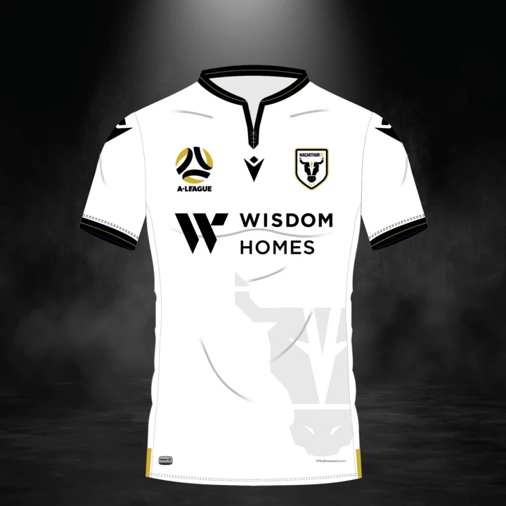
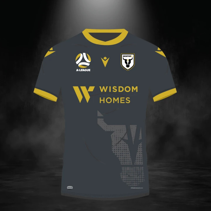
Really like the Macarthur away and both of Newcastles.
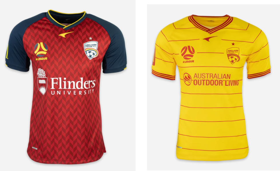
I can see why the Adelaide away has got a bit of stick (cheeseburger wrapper, DHL, surf lifesaving etc) but I think it could be popular with their fanbase. Eyecatching for some reason

Other than the tacky looking bull on the macarthur kit, pretty classy all round in my opinion. The city away should really be their third tbh.

Why do WSW insist that their marketing should be based on trying to make the models look like they want to have a fight?

2 Likes

Fight like your fans!

8 Likes

Well 'ard

Why so many white kits all of a sudden? Don’t get me wrong, I love a white kit, but there’s so many more all of a sudden

Don’t like Wanderers. Don’t much like Kappa. So some good synergies there.
Furious with Adidas for making that for them after the shitshows they served us up.
Those Adelaide ones are different which is a good thing, even with the horrible away kit. It’s good to go with a left field vendor sometimes.

Trying to stop myself from admiring the WSW kit if I’m being honest. I’m a sucker when it comes to Kappa kits

Insert old man comment about the WSW girl at the front spending so much on the jersey that she couldn’t afford a full pair of jeans…

1 Like

Oh, you’re right… it is a girl. My mistake

1 Like

If the jersey looks better with the sponsor than without, it’s definitely a shit bit of kit. And the WSW home jersey looks rubbish without the sponsor.

Looks like a polo, but at least their shirts perfectly match their trajectory as a club, first one being the best and then just getting shitter every year after.

The white collar on the Western Suburbs home kit is a confusing addition.

Doesn’t show on those pics but the kappa branding on the shoulders of the kits is grossly over the top. Horrid. Will go down a treat out west

image

Top stuff