I used to hate pom pom beanies but I kinda dig them now.
Maybe as I get older I’m embracing my inner bogan.
I used to hate pom pom beanies but I kinda dig them now.
Maybe as I get older I’m embracing my inner bogan.
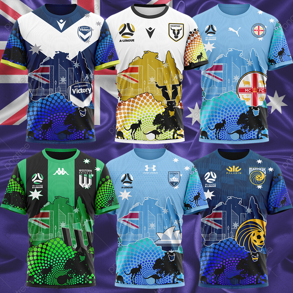
I don’t know how legit these are, but I don’t entirely hate it…
It is zero legit.
And those are abominations
The old A-League logo just to clinch it, too!
I still prefer the old logo, those kits can jog on though
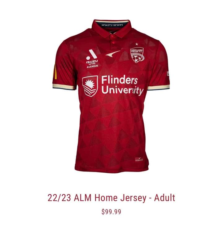
I mean sure, it’s ok I guess
It’s red.
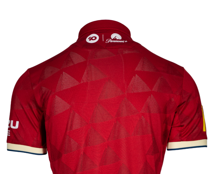
i hate the collar
Nothing will beat the Coopers logo but they always do a good job of incorporating their front of shirt sponsor.
Not a massive fan of the collar, but otherwise, this is a great kit. The logos and sponsorship are nice and clean and the pattern adds some interest without being too busy. It looks classy AF.
Good looking jersey but what’s Cumdog hiding under there?
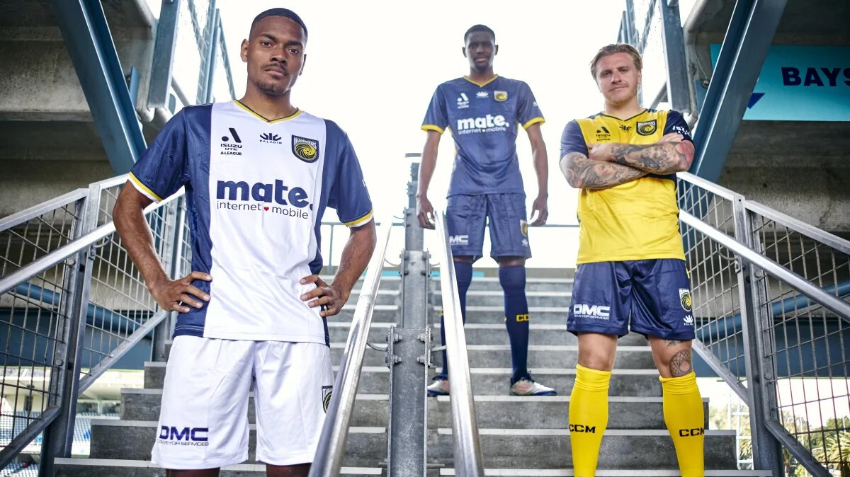
The blue and yellow kits look like they are wet
Your brain just can’t get rid of that memory when we travelled to Gosford, had a great pub session, entered the stadium, sang, had fun, then just to be called off because of rain.
Train back without watching a game was fun. Great times for sure… what a weekend. 
The rescheduled game (4-5 Amazing Scenes) and associated tattoo bet was well worth the abandoned match though.
What a great game that was.
I pity any fool that went and watched a mediocre band instead.
Wasn’t that good.
DaftPunk can GGF