There you go, that is more realistic.
It would be much better without the black wavy shit
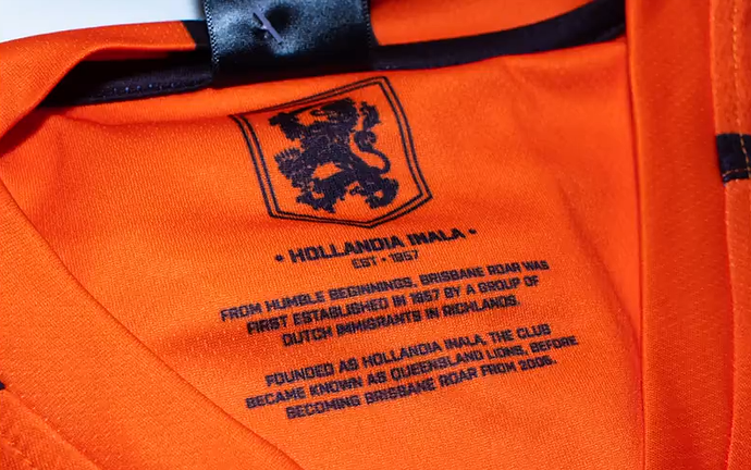
They’re back to admitting they are Hollandia again? A few years ago they were trying to distance any link to the Lions.
They’re also ignoring the Queensland Roar era there.
Was wondering who would be the first A-League club to go with NB.
I actually quite like it. Aside from the fact it kinda looks like tyre tracks, I quite like the stripes (if you wanna call it that…) .
Shit i dont mind it. Considering their dumb colours its not bad.
Melbourne Victory leaving Adidas.
Signing with Macron.
Time for a loooong hot shower, Adidas. 
Thank god Adidas have left that partnership. Ps. would love Adidas to return as our kitmaker.
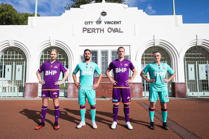
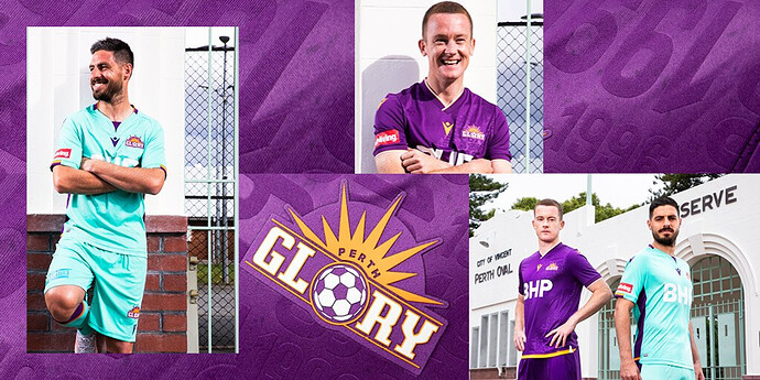
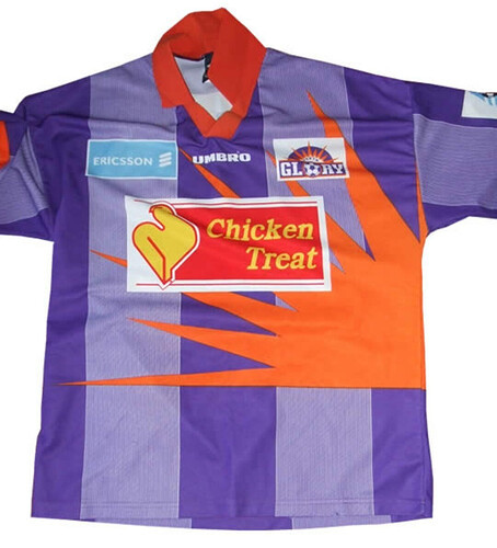
Perth have their new shirt out now, I don’t mind it. Thought they could have gone a bit more crazy, maybe reviving a 90s kit look for their 25th anniversary shirt.
Branners untucked?
It’s so boring
Boring as a kit overall, or as an anniversary kit?
If Sydney released a shirt like that (in the correct shade of sky blue) I would be overjoyed.
As an anniversary kit, it just looks like all the rest of their kits.
Do something exciting.
I like both of them even though the 2nd kit looks like a GK kit.
I questioned him when he appeared in a Sydney photo shoot a couple of years ago with it untucked, they made him have it untucked 
Purple doesn’t suit him at all
These kits are great


