Promo shots always look stupid.
I reserve my right to see how stupid it looks on the pitch.
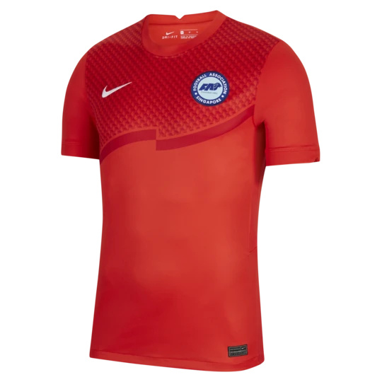
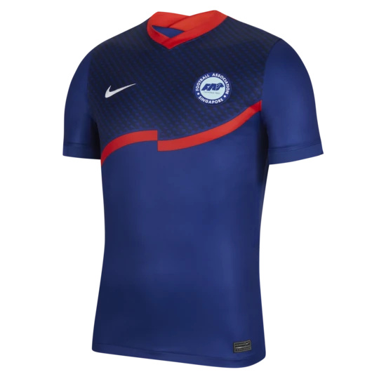
Really rate the new Singapore kits. They’ve got their FA badge on the shirt for the first time in many years, after just having the flag on the kit.
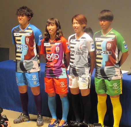
Oh wow, that is really not good.
And haircuts to match.
1 Like
That will be a classic kit in 20 years just like the Socceroos spew kit.
Narrator: It wasn’t.
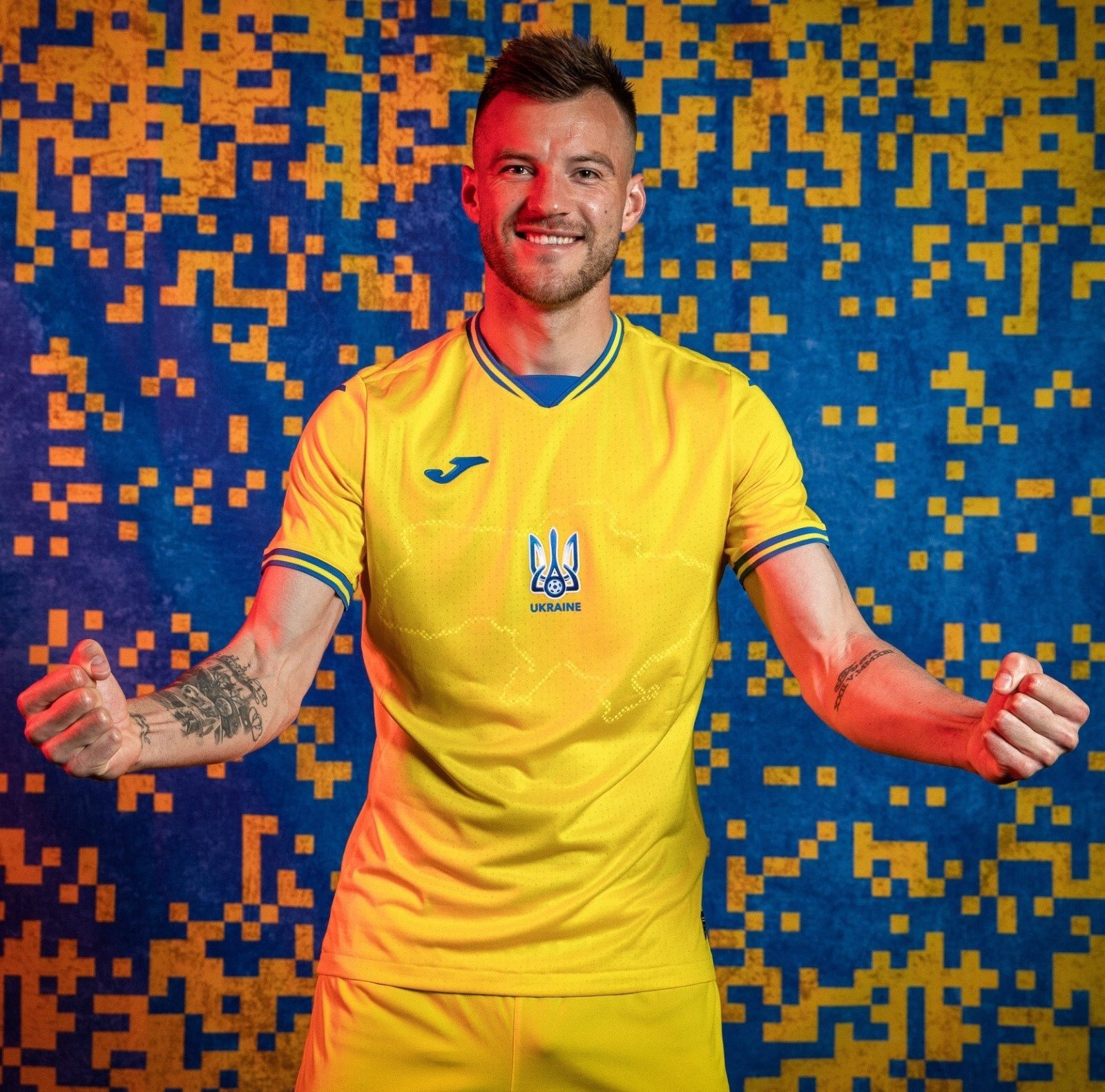
Russia angered by Ukraine kit featuring a map of Crimea & the pro-Russian separatist-controlled regions of Donetsk & Luhansk.
Russian officials called the new national shirt a ‘political provocation’
On the back, a slogan reads “Glory to Ukraine!”
2 Likes
good on em!
1 Like
Real cool for a country with a Nazi problem to put a slogan popularised by Ukrainian Nazis on the back of their jersey.
The slogan originated mainly during the Ukrainian revolutionary war post WW1 and has been used ever since. Currently, the slogan has made a huge resurgence during the latest Ukrainian revolution which ousted the pro-Russian previous President and allowed them at least a semblance of democracy. It’s been the unofficial slogan of Ukraine for over 100 years, the fact that it’s been appropriated by Nazis shouldn’t take away from the fact that it’s a patriotic slogan for the entire country.
Further to this, the slogan was worn by the Ukrainian national team in 2018 and was the directly responsible for the “Glory to Hong Kong” slogan. The claim that it’s used purely by Nazis is commonly used by the Russian government and the slogan was outlawed in Ukraine by the USSR. It’s also used as the official greeting by the Armed Forces and the Police Force.
One for the rainbow kit enthusiasts. Vasco had this for Pride:
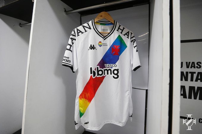
I thought it was a nice example.
3 Likes
So… are we leaving UA or not? (I hope we do)
UA looks like they’re getting out of most/if not all of their football sponsorships, so wouldn’t be surprised if we leave soon. Hopefully back to Adidas.
This is a look…
"The new Inter home shirt has just been unveiled by Nike
‘…uses pixeled royal, navy blue and black to resemble snakeskin, forming the club’s familiar Nerazzurri stripes. The snakeskin pattern is an ode to the coiled grass snake, or Biscione…’
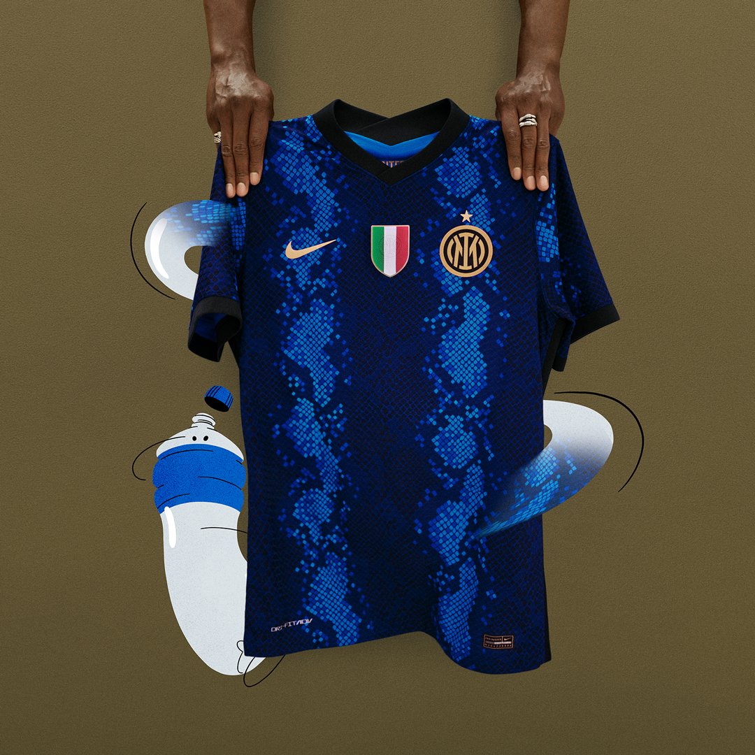
Christ that’s dreadful.
Inspired by Peter Wright.
Stripes don’t work well for kit makers who are intent on doing something “different” every season. A lot of Barca’s recent efforts come to mind.
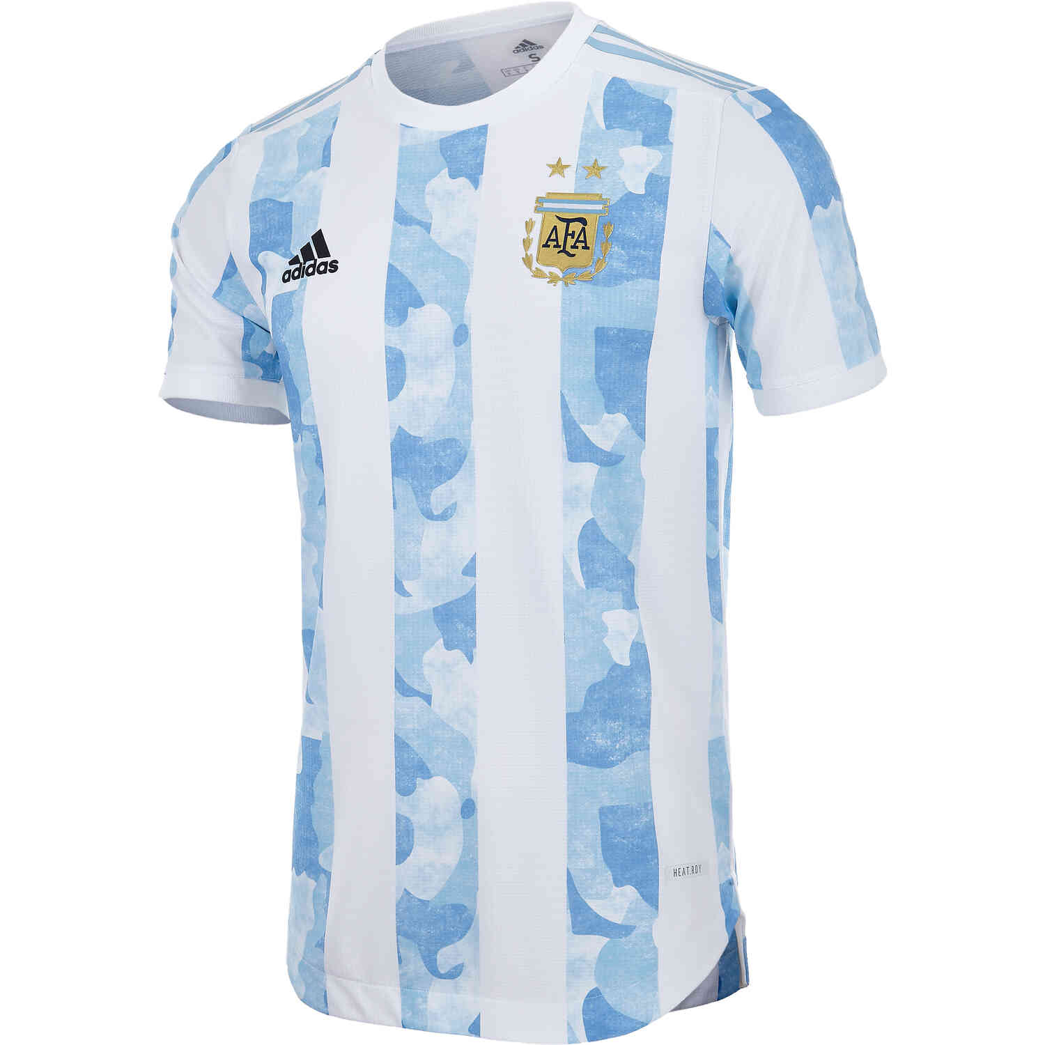
Having said that, I don’t mind the above (dark blue instead of black is wrong though) & I quite like the current Argies kit
An ode to a coiled grass snake. They literally are taking the piss now, aren’t they.
1 Like