An article from a Italian football perspective, they interview a shirt designer from Zeus Sports, a smaller jersey provider on the amateur level mainly, about his favourite Italian jersey’s of all time.
So Atalanta has released a special edition kit for an upcoming match against Roma
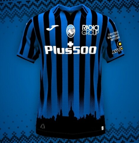
https://www.atalanta.it/news/ecco-la-maglia-del-christmas-match-2021/
The skyline looks pretty nice. Shame that it is a squished and reversed stock image… of Turin 
1 Like
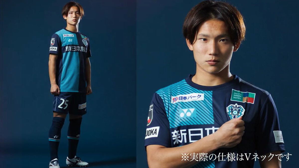
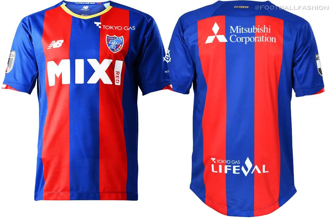
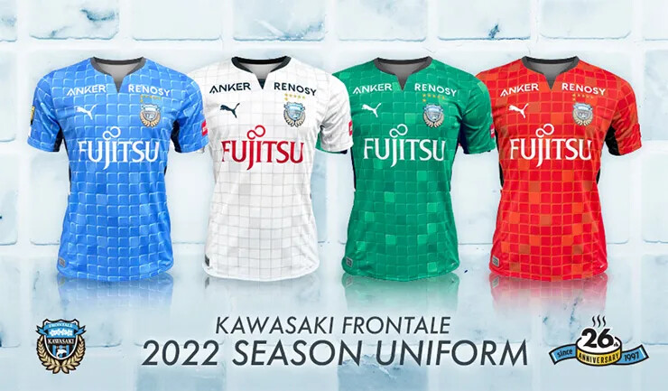
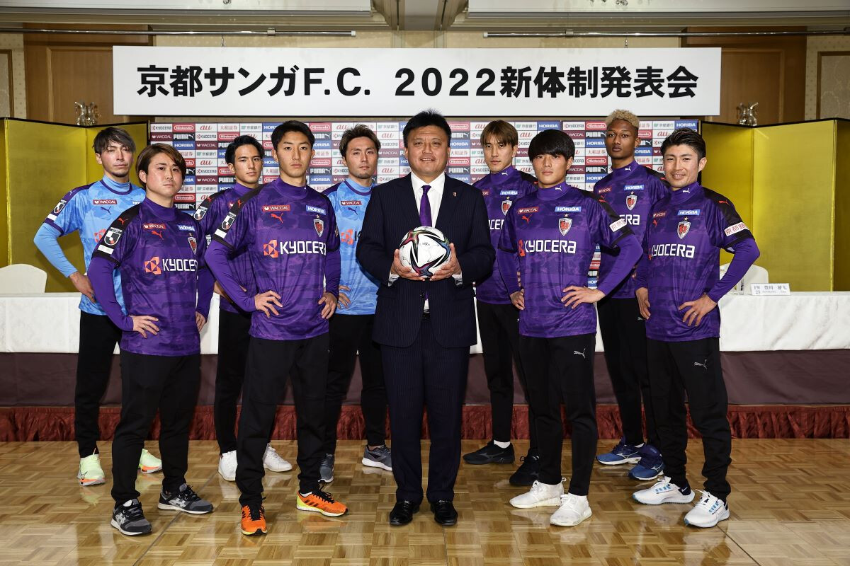
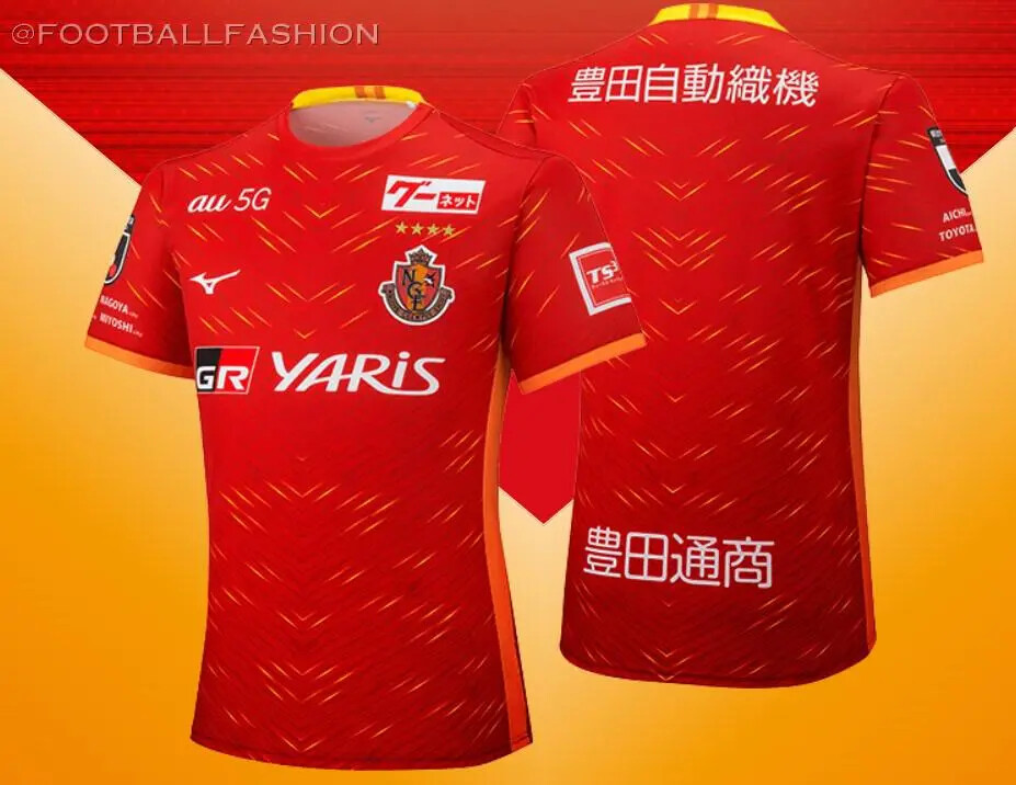
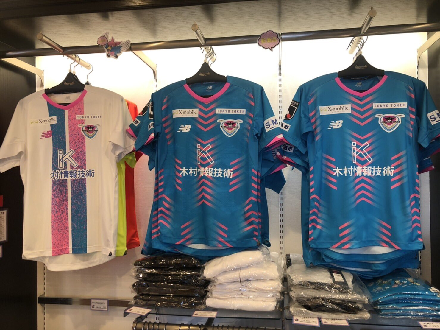
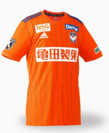
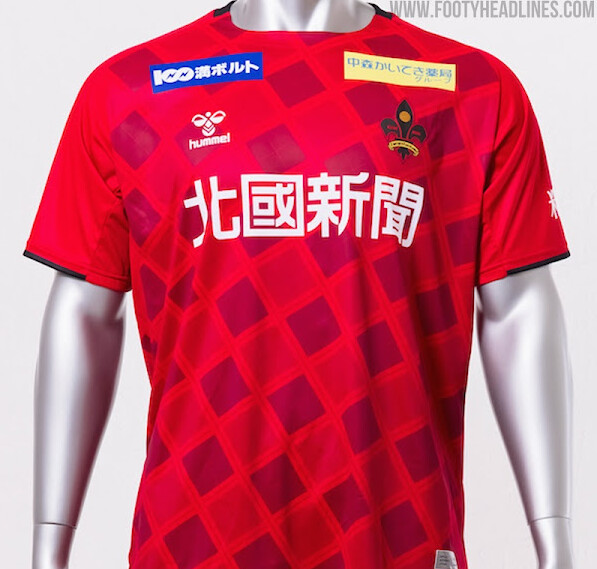
J1 jerseys for the 2022 season.
Avispa Fukuoka
Cerezo Osaka
FC Tokyo
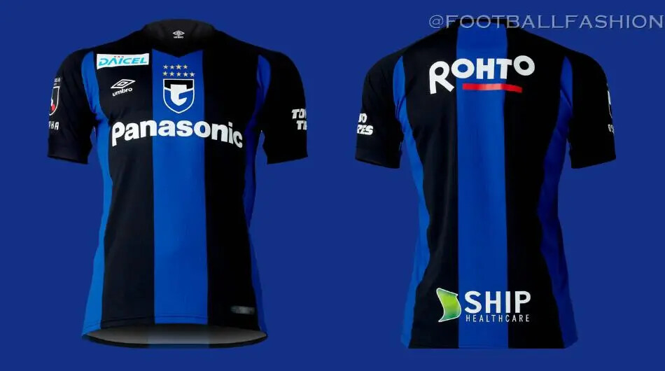
Gamba Osaka
Hokkaido Consadole Sapporo
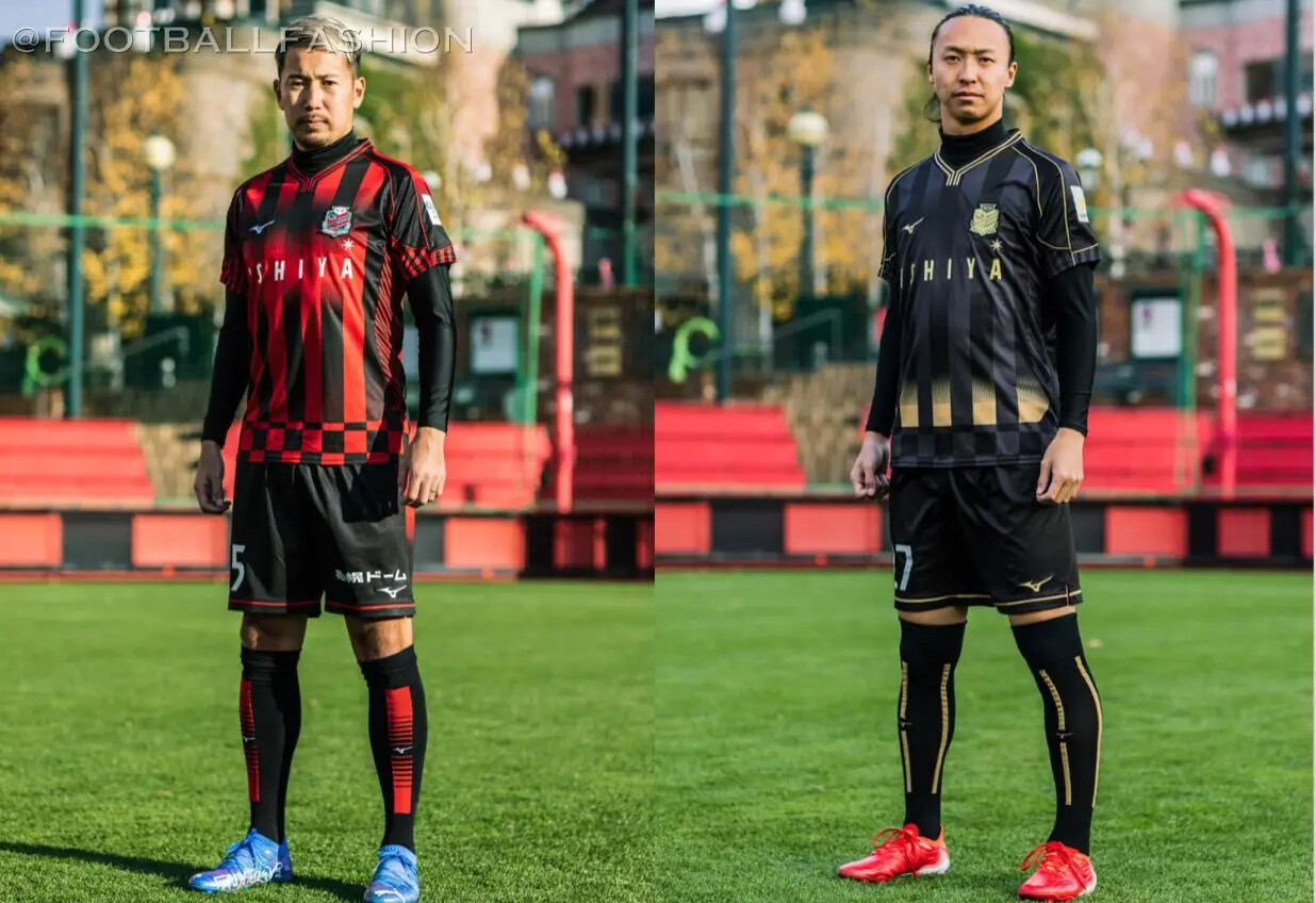
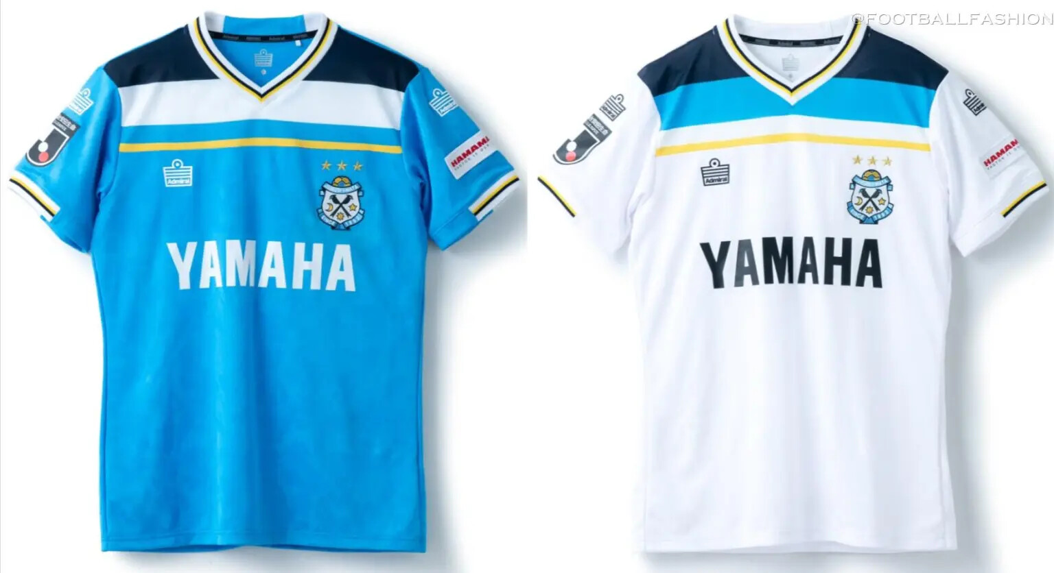
Jubilo Iwata
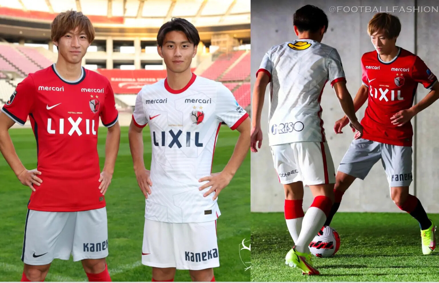
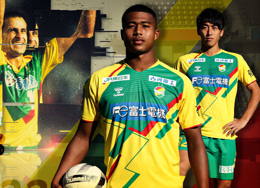
Kashima Antlers
Kawasaki Frontale
Kyoto Sanga
Nagoya Grampus
Sagan Tosu
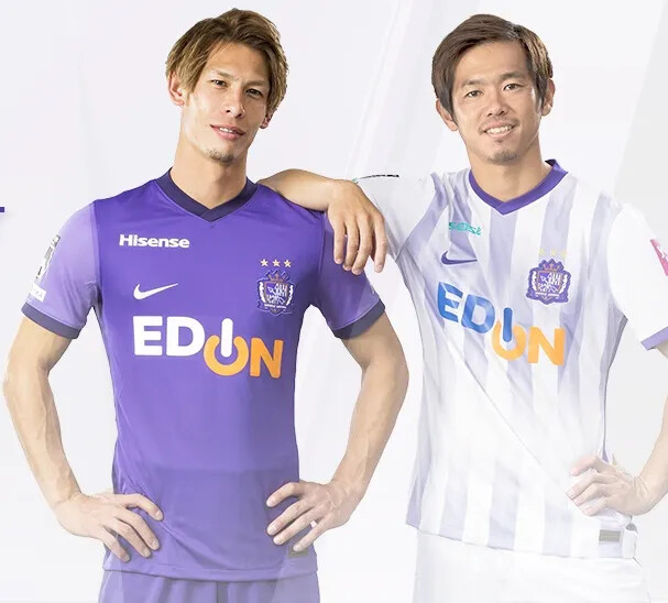
Sanfrecce Hiroshima
Shimizu S-Pulse

Shonan Bellmare
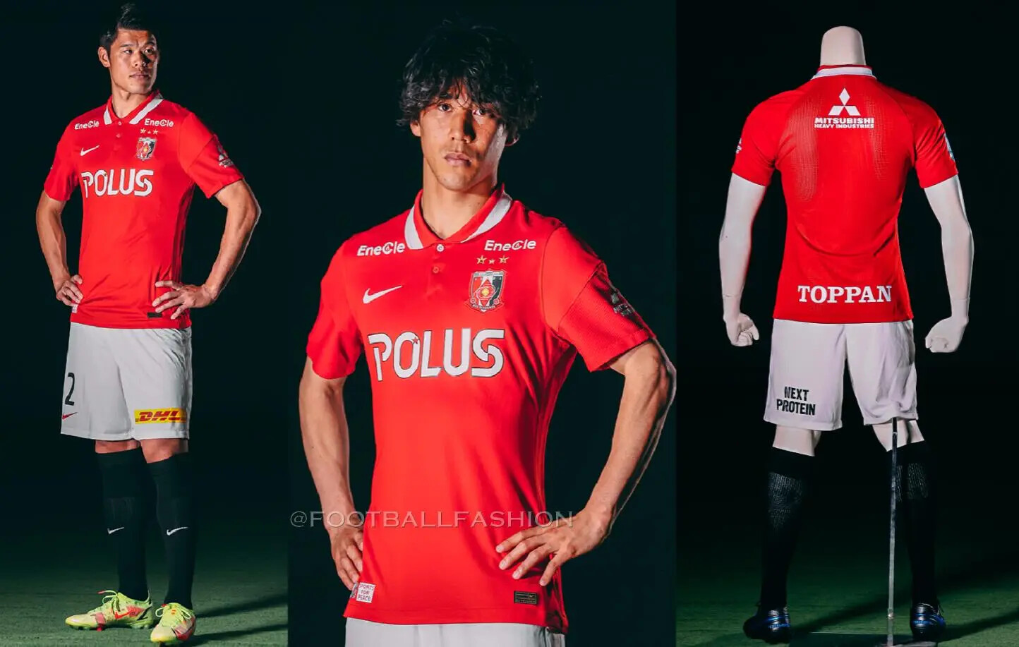
Urawa Red Diamonds
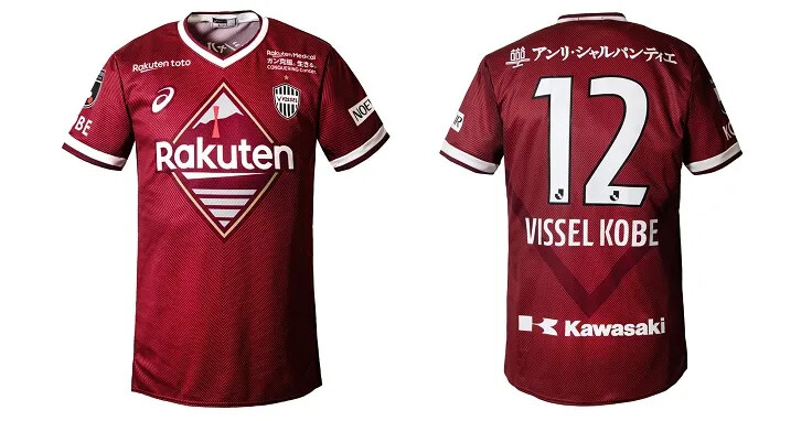
Vissel Kobe
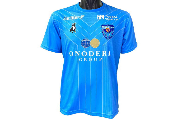
Yokohama F. Marinos

Kashiwa Reysol still to be announced.
1 Like
Jubilee Iwata have just got a new fan
It looks like a 70s England kit, especially that away kit.
I know nothing about Cerezo Osaka but I absolutely detest that kit.

Im always a fan of kits that dont use a generic blue/red/black/white.
Speaking of which that Sanfrecce kit is a classic example of a great kit ruined by a terrible sponsor logo. And Shonans would be neat if the logo was smaller.
I find the new Sanfrecce kit to be extremely dull. They’ve had some absolute classics through the years with really interesting and out-there designs. This new one is just not up to standard. Kashima Antlers home shirt is too boring, as is Urawa.
Not sure the 80s classic style of Admiral kit works as a J.League shirt. There’s no inbuilt nostalgia that gives it a charming appeal, it just looks out of place.
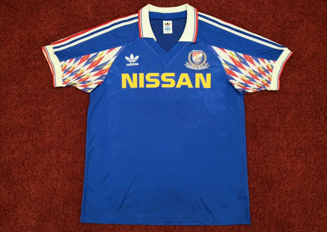
I really like the way Yokohama F. Marinos have captured the spirit of their original J.League kit without just copying the original design. For reference, this was their 1992 shirt. I just think they really missed out on a good thing by not making the away shirt a Yokohama Flugels inspired design.
Sapporo & Frontale the picks for me.
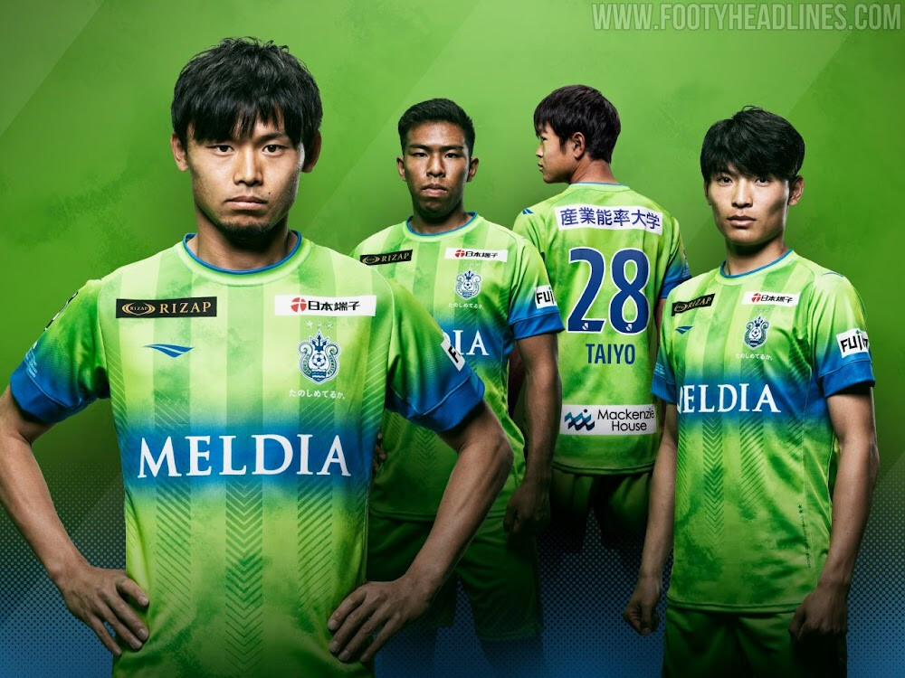
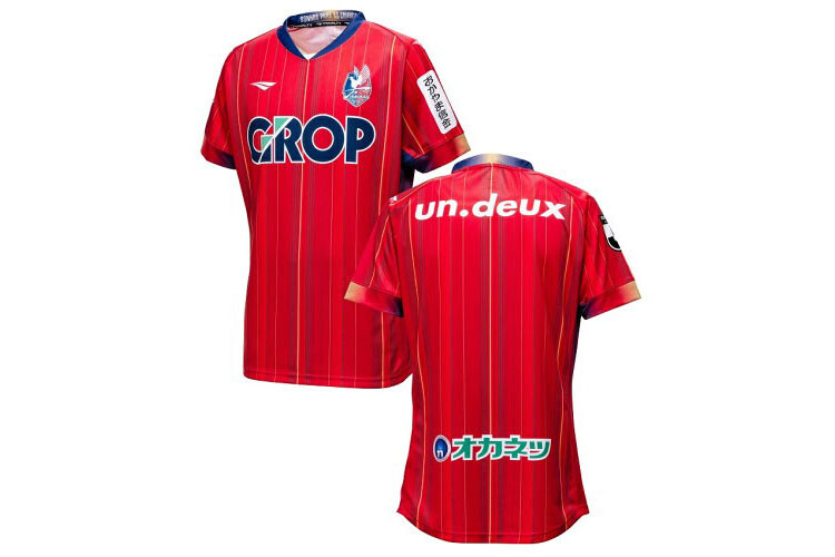
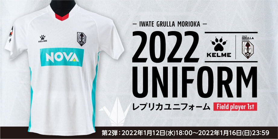
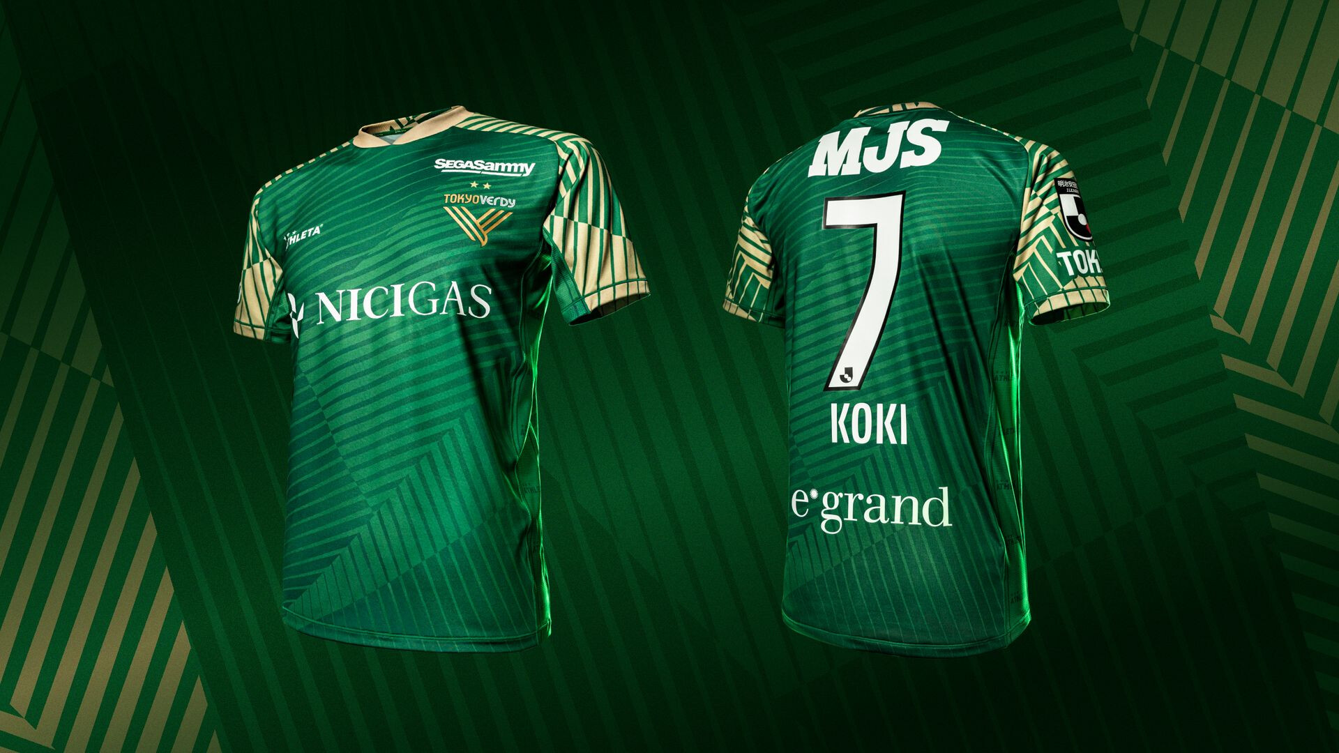
Thought I’d give the J2 League shirts a look. Some real winners in this lot. Some pretty dull ones too. I love the FC Ryukyu, JEF, Thespakusatsu, Tokyo Verdy efforts.
Blaublitz Akita, Oita Trinita, Roasso Kumamoto, Tokushima Vortis, Ventforet Kofu I couldn’t find yet.
Albirex Niigata
FC Ryukyu

Fagiano Okayama
Iwate Grulla Morioka
JEF United Chiba
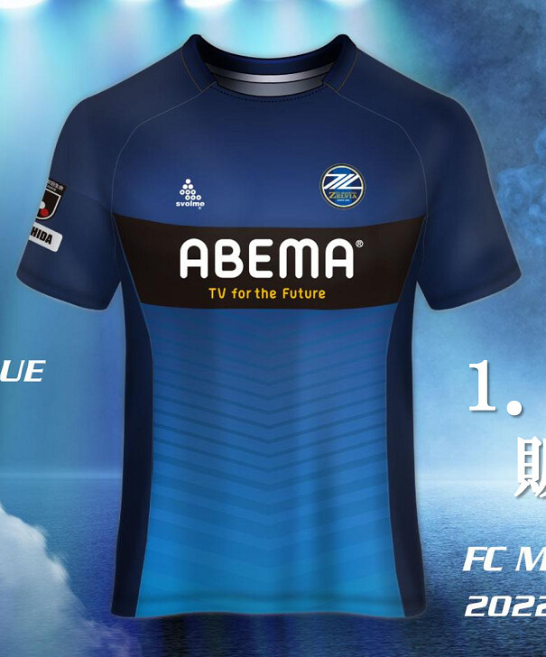
Machida Zelvia
Mito Hollyhock
![]()
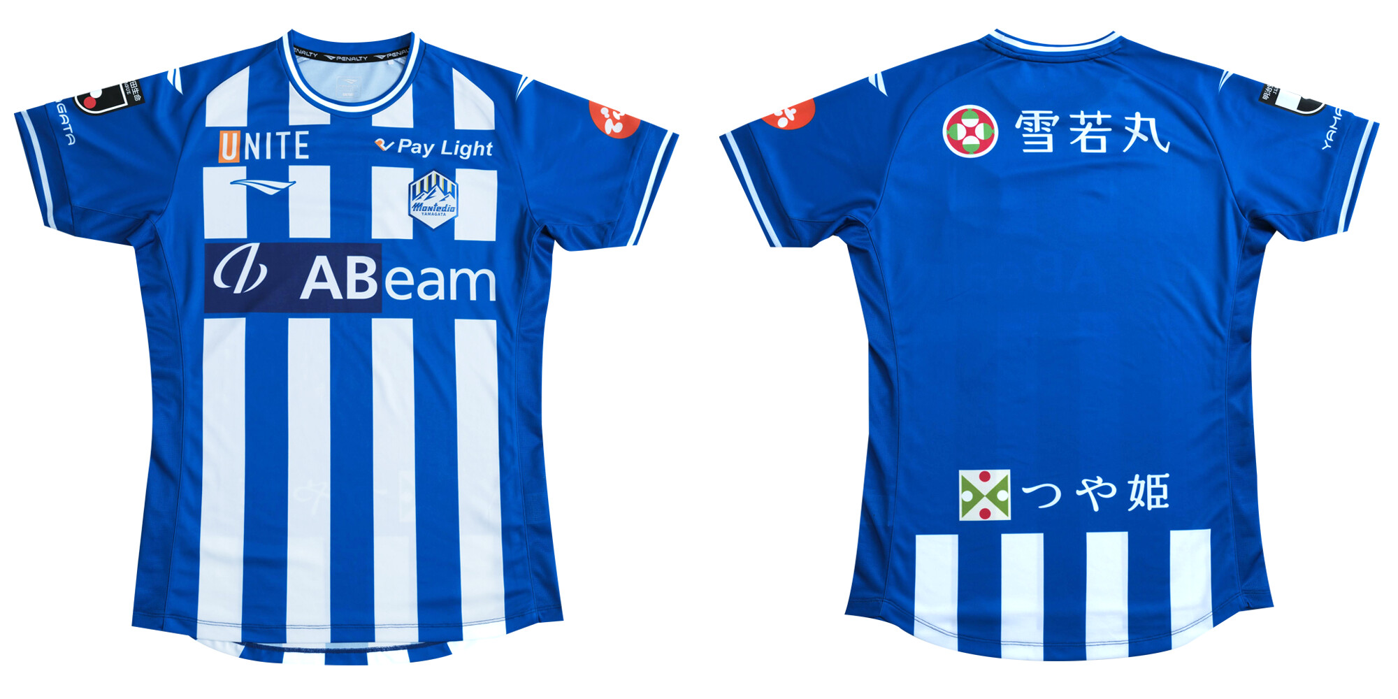
Montedio Yamagata
Omiya Ardija
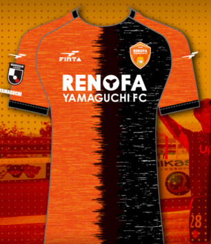
Renofa Yamaguchi
Thespakusatsu Gunma

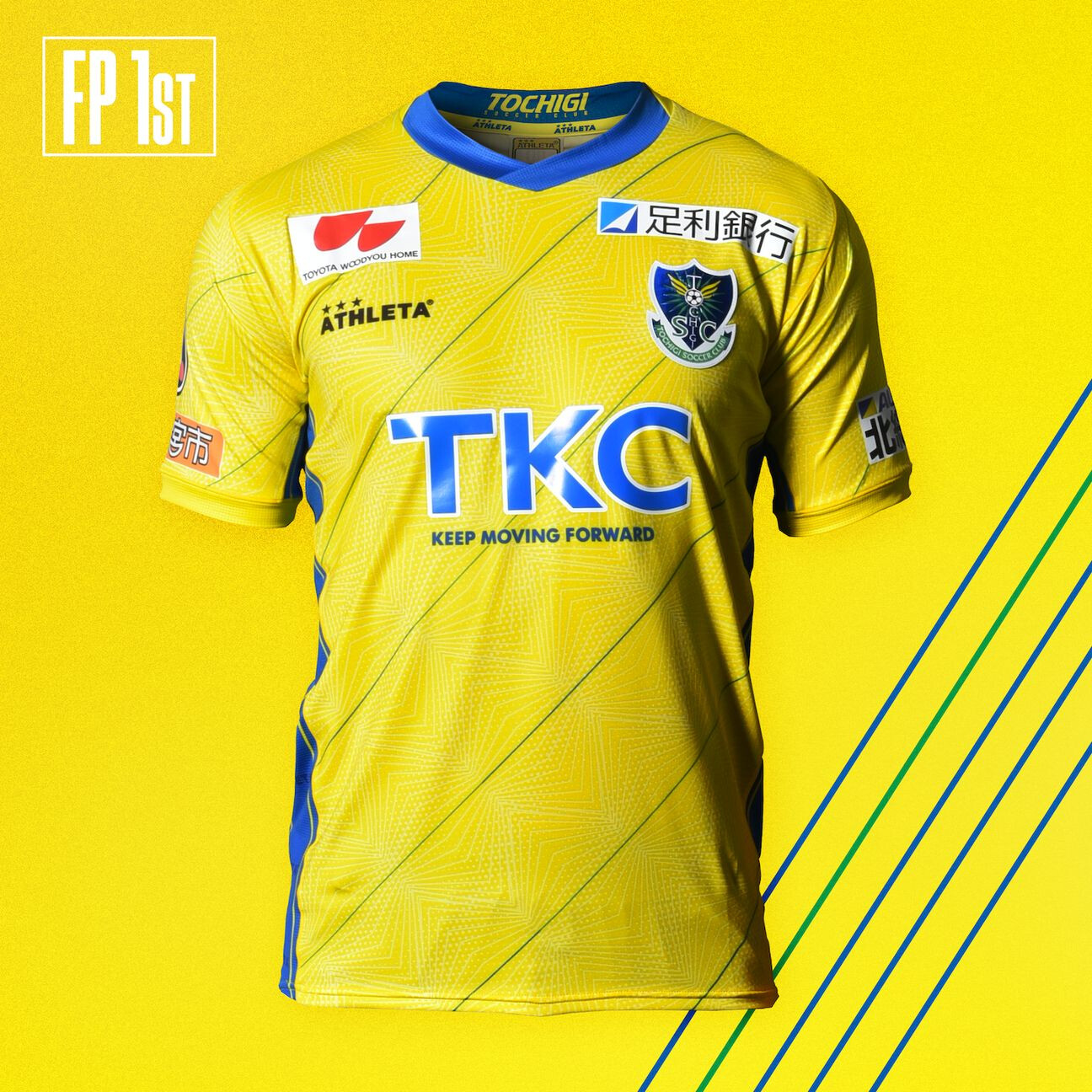
Tochigi SC
Tokyo Verdy
Vegalta Sendai

V-Varen Nagasaki
Yokohama FC
Zweigen Kanazawa
Would like to see a real version of that Yamaguchi one. Could be great.
Ryukyu & Verdy are great but not there with you on the JEF.
I like shirts that are tributes to the early 90s pre J.League era.

That shirt design is massively shameful.
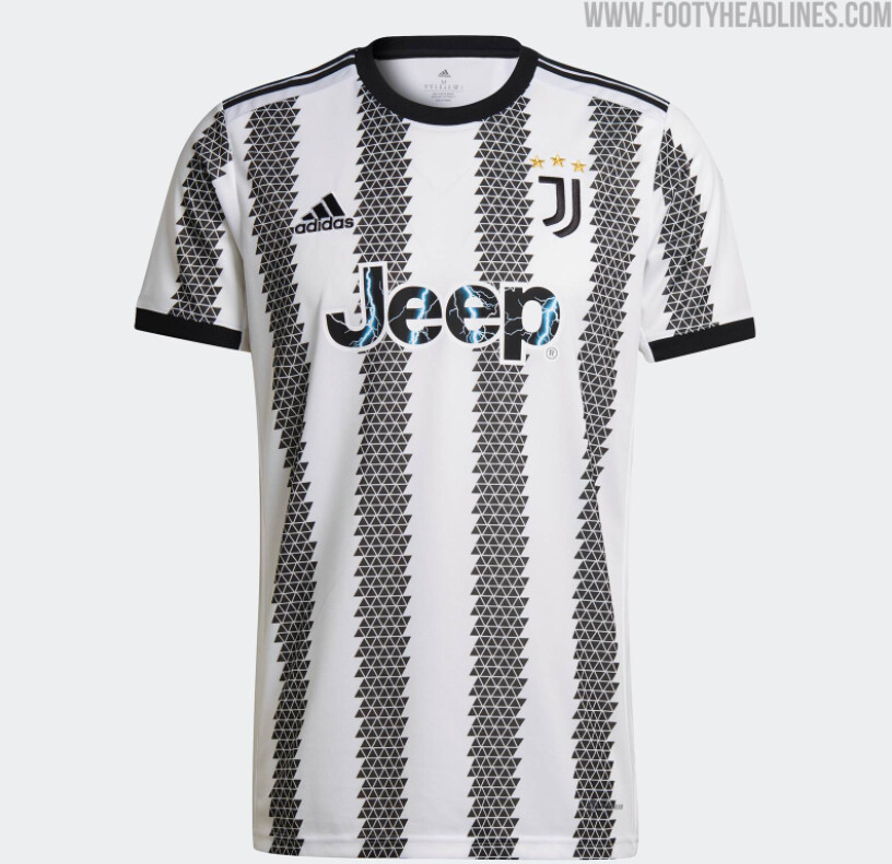
I don’t know how you can fuck up black and white stripes but that Juve offering and Newcastle’s kit from this year that somehow manages to put a 4 on the front of every shirt are fucking horrendous.
It would be like fucking up a sash shirt.
1 Like
There’s a catalogue of striped shirts that have been maimed in recent years.
Remember all those Newcastle fans who wanted Ashley out for years? They should’ve been careful what they wished for.
What do you mean they’re fucking delighted. They just wanted more $$$ and everything else can go to shit.