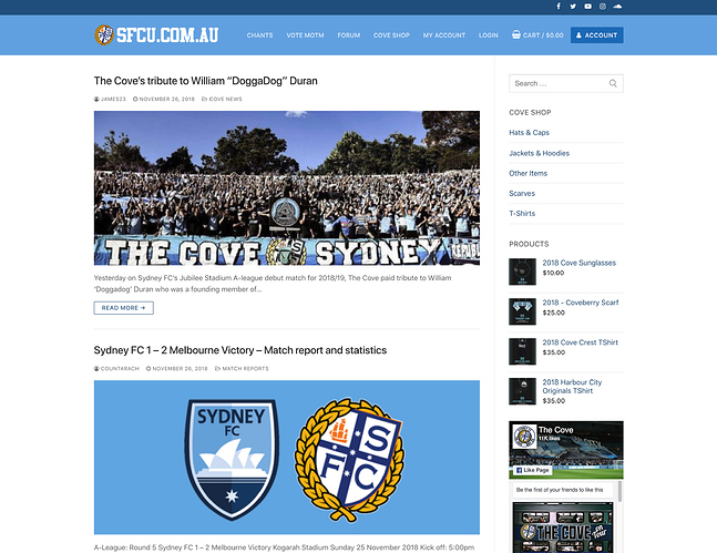
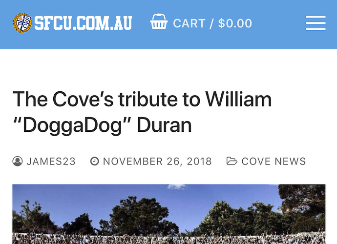
Updated the theme for the main site and shop! Enjoy! Post any feedback or ideas here!
I like it 
The only criticism would be that there’s a fair amount of blank space on the left. I’m not really sure what that could be filled with, though.
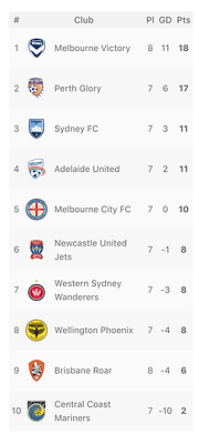
I’ll be adding in the ladder and upcoming / recent fixtures soon as widgets
So a really small thing that might or might not be fixable; the posts on the front page don’t seem to work so well when copy/pasted from Word. They used to be fine with this but now if you copy and paste it looks like the below:
https://www.sfcu.com.au/2018/11/11/newcastle-jets-1-1-sydney-fc-match-report-and-player-ratings/
You have to manually fix up the paragraphs on each post now which isn’t hard, just a little annoying.
Which editor did you use in the Post? If copying from a word doc use the Visual Tab rather than text as text is just raw html and will just be text.
Ideally we won’t need the heading in the post content and should come up with a template for the Title and post content so you can just copy over raw text and format it in the editor. You could also just copy and paste your doc in then click on ‘Clear Formatting’ which will clear the word doc formatting then quickly format it with the editor options.


