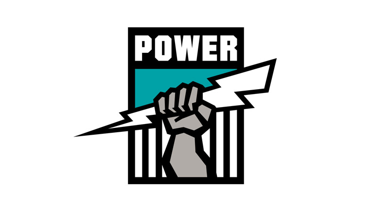
Looks a bit T20.
It’s ok, will no doubt date and be changed in 10 years anyway.
That was my thought. I actually liked that old logo.
It’s fine.
Theres 3 variants floating around. The white/green above, the black/green and then a black/white one.
Different ones for different coloured jerseys?
Yeah must be. Assume the white/green is the main one because thats the image for the facebook/twitter.
In a stament released by the club on Tuesday, they reveal the design has been inspired by the aerial view of real estate development (rooftops) in Australia’s fastest growing corridor, borrowing architectural cues from the iconic West Gate Bridge – the gateway to the West.
The logo’s signature green colour symbolises freshness and the evergreen community of cultures residing and growing in the West.
But unlike many club logos, United’s breaks from convention of not being encased in a crest, which the club believes brings an “air of confidence”.
“The result is a minimalist and refreshing design which reflects the club’s bold, innovative and aspirational ambitions, both on and off the field,” Bisetto said.
All of that or, more likely, some intern in marketing was told to turn this into a W, change club names and have the fist hold a soccer ball. 2 out of 3 wasn’t bad for the kids first go.
Meh it’s fine. At least it hasn’t got a soccer ball zooming off into the ether or ‘est. 2019’
They should embrace the whole newness thing and add one of these to the corner of their logo:

Fuck trying to look more respectable with the “been here XXX years” schtick.
TurdTards!
Their logo is a North Queensland Fury jersey?
Is the marketing industry a practical joke?
That sort of insufferable wank comes out every time there’s a new anything.
I can’t imagine the level of smug that would have burst out of their office when they came up with that crap.
There motto should be…" we’re Tards, but not as you know them"
I wonder if Lou Sticca has dropped the whole “we should design it around the Juventus logo” idea.
Been rumoured for a while but this one is finally confirmed. Delianov signed. Signing news: Western United FC add first goalkeeper to their squad | Hyundai A-League
I was thinking that problem with the logo is that it’s not contained within anything (shield, circle, any kind of border), so the text and the image are separate. We had the same problem with the old Sydney FC logo. It never looks quite right on jerseys.
I then noticed a crest version of the logo, that would be more applicable to whacking on the front of a jersey. It looks a lot better in crest form, but the only place I’ve seen it is on the A League site.
Youre right that green border and black surrounding on the white/green W looks very decent.
Yeah, kinda think they should have run with that in their big launch. Strange that they didn’t.
I am certain that’s how it really went down. The marketing consultant then came up with the spiel to justify it over his morning coffee, knocked off at lunchtime and spent the afternoon celebrating doing lines off a hookers tits.
It just looks like a pitchfork to me.

