Oh, but you just know we’ll break out the Third strip…
I’m seeing white and gold. What are you talking about?
Played it too safe, too much of “like its done over there” boring.
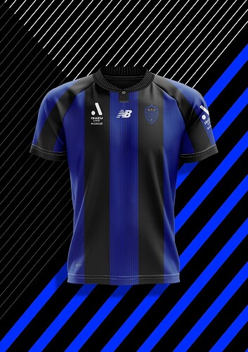
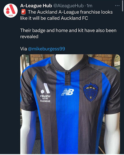
I don’t mind the logo. Doesn’t exactly pop on the shirt being basically identical colours, but the design is alright.
That’s a very sleek kit, and the logo isn’t terrible against it (the stripes matching is nice).
The mockups without the pinstripe (??) looks better. Granted they are in the background and not all that visible in the mockups themselves…
New Balance as a kit provider.
I think that’s a first?
Should have been called the Earthquakes.
Too soon?
Had Bill Foley owned the San Jose Earthquakes, might have been an option. They play in blue and black too from memory.
Brisbane Roar have New Balance
Are you thinking of Christchurch? Nowhere near Auckland.
Don’t mind the name, logo or kit. Forza Bimbi
Sydney FC v Auckland FC, the real name derby?
Your name doesn’t roll off the tongue,
Your name doesn’t roll off the tooongue,
Auckland FC
Your name doesn’t roll off the tongue!
It’s a short hike away. The whole country’s the size of Western Sydney.
Is that because of the hobbitses?
In fact, that’s their nickname now, The Hobbits.
None of the LOTR filming was done in Auckland, FYI.
Name - fine
Logo - I like the general design but it’s a little too simple. Sort of looks to me like a Japanese team logo but it needs a bit of extra detail. Not horrible.
Colours - like them
Kit - pinstripes are too heavy but dark blue and black vertical stripes are excellent.
Overall pretty happy with it, get the sense they will be pretty successful off the pitch - Auckland is a bigger city than Wellington (much bigger - almost 4x the size) and their stadium is at least the right shape.

